
Exploring the Relationship Between Color Psychology and Digital Marketing
The modern internet has become a crowded place to do business.
Competition is fierce, with thousands of companies using big-budget content marketing campaigns to capture the fleeting attention of potential buyers.
If you’re looking to compete with the big brands and take your digital marketing game to the next level, you’re going to need a few extra weapons in your arsenal.
Understanding the psychology of color, and how it affects buying intent, could be the secret sauce you’re searching for.
The psychology of color in digital marketing
Colors play a vital role in telling the story of your brand. They help to give meaning and context to your advertising and website design and more than any other tool at a marketer’s disposal, they have an instant and profound impact on the way potential buyers think and behave.
90% of the human brain relies on visual cues. Color has the unique ability to quickly and efficiently direct the eye, explain (without the use of words) what action to take next and how to interpret an element on a page in order to define its con- text.
Color psychology has been widely studied for well over a century, and despite the subjective and cultural nuances involved, it’s a well understood discipline that can yield measurable improvements for the marketer willing to study the science.
The psychology behind the most popular colors
The color red
Red is a dynamic and powerful primary color with an energizing and polarizing effect. Red can show love and attraction, but also portray fear and terror, depending on the context.
In general, red should be used sparingly on websites because it can invoke negat- ive reactions of danger and fear.
For online marketers, the color red is best reserved for buttons where a user is required to take an action. In this context, red conveys a sense of emergency: “Buy now before it’s too late!” being an obvious example.
The color yellow
Yellow signifies joy, happiness and optimism. The color yellow has one of the longest wavelengths, and has an easygoing, pleasing nature that increases confidence and lifts the spirits.
The color orange
Orange sits (as you would imagine) between red and yellow in color psychology. Orange is friendly and fun, with a positive vibe and a youthful energy. Orange is a motivating color that’s great for creating a sense of enthusiasm and freedom.
The color green
Green is the color of nature. It’s organic, lush and life affirming. On the other hand, green can symbolize financial growth and materialism due to its association with money.
Green is an obvious choice for health-based websites and marketing, but it’s also a powerful psychological tool that can be used to “give permission” and reduce friction when you need a user to take action with a button click.
The color blue
Blue is by far the most popular “favorite color”. It has strong connotations of trust, dependability and calmness. The color blue is a very neutral color with few negative associations. Blue brings a sense of professionalism and responsibility to your content.
Black & white
The monochrome “colors” of black and white are obviously most associated with the written word. They are straightforward, clean and precise. In modern digital marketing, the use of black and white is most often seen in minimalist, luxury brands, where cleanliness and confidence are the desired aesthetic.
High contrast, monochrome websites and branding can look classy, but it’s important not to go overboard: Too much white space can give off a clinical, sterile feeling, and websites in particular will become unreadable if they rely heavily on black backgrounds.
Gender and color preference
A large study by the blog Kissmetrics found some interesting differences in the re- actions to color depending on the gender of the viewer.
Here are a few choice examples:
– Blue is the favored color by both men (57%) and women (35%).
– Men dislike brown the most.
– Women dislike orange the most.
– Colors that were disliked were also seen as “cheap.”
– Men have a higher tolerance for grey shades than women.
– Women preferred tints while men preferred pure or shaded colors.
– A majority of men (56%) and women (76%) preferred cool colors.
– Orange and yellow grow increasingly disliked as both genders get
older.
– In general, women see more color variations than men.
What can we take from all of this?
Surveys like this are fraught with issues of replication and reliability, but we can say one thing with confidence: It absolutely pays to understand your audience and adjust color palettes appropriately. For example, the results of this study clearly show that young men have very different color preferences and tolerances to older women, for example.
But does this color stuff really have an impact on sales?
Absolutely! Color science and psychology is driven by advertising. Pro marketers are only interested in results. They care very little for art and aesthetics!
Consider these statistics:
– Website visitors will make a judgement about your site within 90
seconds.
– 90% of that judgement is done based on color.
– 85% of buyers make a purchasing decision due to color choice.
– 80% of people use color as a visual aid to acclimatize themselves with
your brand and website.
Color & conversions
Now you have an idea about color and how it can affect mood and buying intent, you’re probably wondering how you can implement this knowledge into your own content and marketing strategies?
Let’s focus on conversions
Broadly speaking, a “conversion” describes the moment a person takes an action on your website or sales page. If they click on a button to buy something, or fill in a form to subscribe to your mailing list, they’ve been “converted” and are now in your sales funnel.
Color choice can drastically alter your conversions, with the exact same sales page or signup form getting wildly different conversion rates simply by changing button colors alone:
– Performable increased click through rates by 21% by changing a single
button from green to red.
– When Quicksprout changed a homepage call-to-action button from
blue to yellow, conversions increased by an unbelievable 38%.
The takeaway here?
Always A/B split test your buttons and signup forms. Never take color choices for granted or choose a color based on a personal whim.
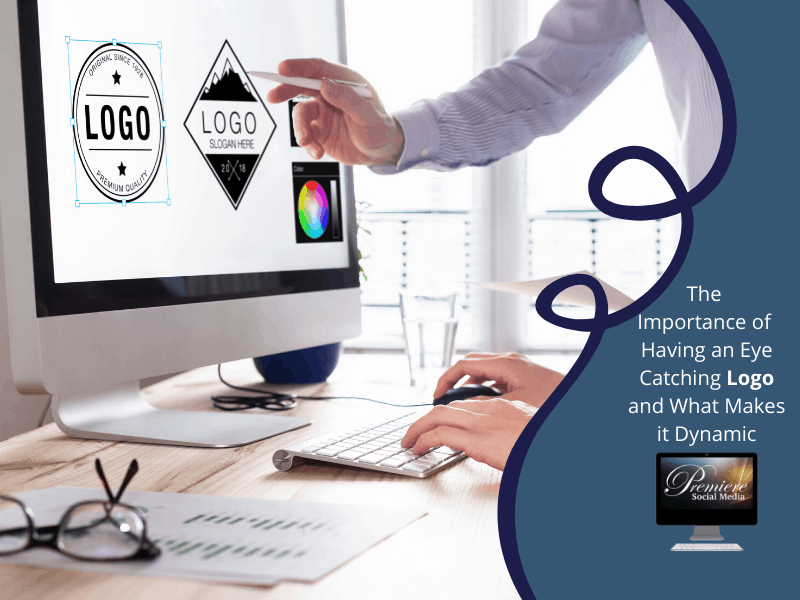
What about logos and branding?
OK, so we now have a handle on how color psychology can impact your sales pages and signup conversions. We know that color can influence mood and first impressions. We also know that color preference is very different for those of different ages and genders.
So where does that leave your main brand and logo design? How can you use what you’ve learned about color psychology to make the right design choices for your business?
Brand personality
It’s really important to make key decisions about your brand’s personality at the early stages of design and development. Are you serious and authoritative? Perhaps you’re fun and energetic? Are you youthful or mature? Masculine or feminine?
Now you’re aware of how color can shape perception, it’s important you make choices based on your audience’s (not your own) preferences.
Know your audience
The key to understanding your audience is market research. If you’ve been in the marketing game for any length of time, you’ll understand just how important it is to define the “ideal” or “archetypal” user of your product or service. If you’ve already created a “buyer persona” for your product, you can think about how that person would perceive colors, and make a choice based on data, rather than guesswork.
Research the competition
How do you rivals handle logo, color and style choices? What seems to be working for their audiences? Be careful not to get too wrapped up in what your competitors are doing. After all, they might have chosen their branding on a whim! With that being said, if you can spot obvious trends that dominate your niche, you’re probably onto something…
Stay authentic
If you want to avoid guesswork and hate the idea of copying your rivals, you could do a lot worse than actually asking your audience for their opinion!
Customers value authenticity. Leverage your email list, reach out to your social me- dia networks, conduct surveys and run competitions. You’ll be surprised at how enthusiastic your audience can be if you take the time to listen to them.
If you’re a really savvy marketer, you could actually create several different style guides and logos and have your fans rate them. The feedback you gain can be very powerful indeed.
Color psychology in conclusion
When it comes to color choices, it pays to know your audience. Colors are perceived very differently by gender and age, and the final color palette of your logo and website can have profound effects on the future success of your brand.
If there’s one take away point to remember about color psychology, it’s to test, test and test again! Find the perfect color combo for your site, and conversions will soar…
8
Recent Comments